This is The Global Sharknado Threat Map. Created by an unprecedentedly cross-discipline team of nameless chain-smoking scientists in white lab coats, this map is intended as a resource to coastal communities regarding the nature and likelihood of a sharknado incursion. Right?

This map was originally conceived by Drew Skau, and commissioned by Visual.ly. This is a reconstruction to show how the how-to-edness of it, step by step. Reasonably easy to assemble, it is a fun experiment with tapered hatched fills and call-outs. Here’s exactly how it was made, and how you can make it, too. If you dare!
Data & Resources
- Bathymetry (link to Esri image service)
This is a bathymetric layer showing delicious undersea terrain. It requires a subscription to use, so, if you don’t have that, here are some alternatives: You can download this enhanced satellite image, which looks slightly different but is still really cool. Or you could download these bathymetry layers and stack them up in cool ways. Or come up with whatever basemap you think looks cool. - Coastal Shark Habitats (zip of six shapefiles)
Believe it or not, I’m not a shark expert. So take these files for what they are worth: illustrative data for use in a tutorial. The habitats were manually digitized from various online references, then clipped to 150, 200, and 250 mile buffers of the coast. - Hurricane Point Shapefiles (zip of six shapefiles)
The source of this storm data is curated and made freely available by NOAA, and goes back to the mid 1800s. For this map, we’ll use hurricane categories 3, 4, and 5. - Country Borders (lots of options)
Any country border file will do. It’s used as a minor reference. You can download one here or here. Or any old place. - Global Hexagon Mesh (link to Living Atlas download)
A full-coverage 500km-cell hexagonal mesh of the world. I’ll use it to select a handful of locations of interest, for annotations. - Firefly Icon Images (zip of six PNG images)
Handy little glowing dot images for use as point icons in any old map.
Alternatively, you can download this whole big massive ArcGIS Pro project package.
Ok, let’s begin our important service to humanity.
Habitats & Hatch-work
Starting off with a generic shape of land as a reference, I manually digitized the general shapes of Great White and Great Hammerhead habitats. These shapes are really rudimentary and cobbled together from a handful of estimates I’d seen on the web. I used ArcGIS Pro’s feature creation and drawing tools.

Then, I generated some buffers out from the land. I made three separate buffer zones, 150 miles, 200 miles, and 250 miles from the coast.

I ran a spatial intersection of each buffer distance against the Great White habitat and the Great Hammerhead habitat. The result is a set of three habitats for each shark, trimmed to coastal distances of 150, 200, and 250 miles.

Take a look at the table of contents in the image, above. Rather than a solid fill for the polygons, I’ve given them a hatched pattern fill. See how each zone, at increasing coastal distance, has a slightly thinner stroke used in the hatching? That’s a simple hacky way to give the edges of the habitat zones a sweet sweet tapered hatchline effect. I like it because it helps to imply a fading off feel of uncertainty, which is just fine given our topic.
Also, the two shark species get their own color, and I’ve rotated the hatching direction 90 degrees. This way, when there are overlapping habitats, you get a good visual sense of mixing via color and pattern, rather than one overlapping the other (reminding me a little bit of Slack’s logo). Here’s a closer look:

If you haven’t already, you can download these shapefiles and try the hatching trick yourself.
The Bathy Basemap
Time to pull in some background data to provide context. I’ve added the bathymetric layer and a countries layer. The bathymetric color ramp is super dark, going from black, to almost black (dark blue -a contrasting color to the habitats, so it does not bias them). The countries layer has a black fill with a similarly faint dark blue outline. Since these layers are only there to provide a sense of location, and don’t impart their own message themselves, I kept them sparse, low-contrast, and devoid of unnecessary detail. Busy basemaps are just the worst amiright?

I also modified the projection to have a Pacific-centric focus. This is the “Times” projection. Don’t think for a minute that I would have been using unprojected wgs84 / equirectangular / plate carrée / etc.
Hurricanes & Hexes
Ok, we have a representation of oceans and some serviceable coastal predatory shark habitats. Now what? It’s no secret that hurricane forces have tremendous uplift capabilities, capable of picking up and depositing material far inland. Additionally, the phenomenon of coastal hurricanes spawning powerful tornadoes is well known. Naturally, enormous, hungry, enraged sharks will use this confluence of natural and unnatural forces to enable coordinated aerial incursions into coastal areas. We live in the age of the sharknado.
Pulling in a big pile of historic hurricane location data reveals some clear concentrations and structure. Try it out yourself with this data, using these icons. Here is a side how-to related to mapping hurricanes.

A quick visual inspection of the map shows some interesting areas, that could use some explanation. I’ll pull in that global hexagonal mesh, and manually select cell clusters that bear some explanation.

Based on the selected hex cells, I create a separate layer for the new call-out zones. Notice in the table of contents that I’ve duplicated it three times. One is a fine line, and the other two are given line weights of increasing transparency and thickness, to give a hacky nebulous glow effect.

Layout & Annotation
Now for easily the most time-consuming portion of this map…putsing around in the layout! I created a new layout view, and added in my map. Here, we can pull in all sorts of secondary content.

The top and bottom of my map are pretty busy with coastal and bathymetric detail. Since they are far away from the action, and since I spent countless hours in the darkroom in college photography classes, I’ve pulled in a vignette overlay image. It’s just a PNG image with dark opacity at the top and bottom and a smooth transition to full transparency at the middle.

Which, when placed over the map, burns in the edges, looking like this:

Now it’s time to append this map with all sorts of fascinating scientific analysis. I used Courier New to give a retro teletype sort of feel. The call-out lines were drawn manually.

Same font for title and legend. Some folks like to mix a couple of fonts for their maps, but I’m not nearly good enough at judging type to pull it off. So I play it safe an go one-fonted.
The legend is a series of labeled images. In Adobe, I traced some shark outlines and filled them with a hatched pattern similar to the map. Using the shape of the sharks in the legend has two big benefits. The first is that it reinforces the theme with a visceral, recognizable shape. The second is that I can avoid the clunky math equation style legend of “[box] = shark habitat”.


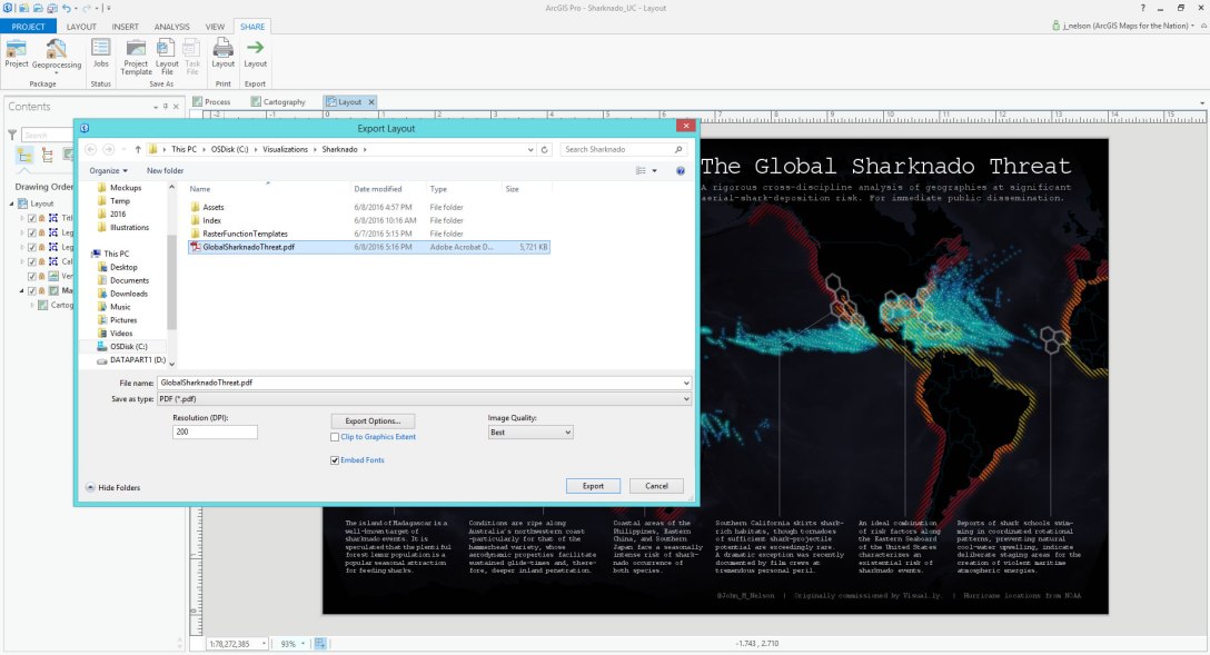
Once you have all the pieces in place there are lots of export options. Here’s a look at the PDF export settings. I like that you can adjust the output resolution.
And that’s it! You made a sharknado map. And lent your skills to the service of combating this terrible scourge. I, and posterity, commend you.


Really cool graphic, and very useful to see how you made the effects. Thanks for posting. Hopefully it brings some much needed awareness to the danger of sharknadoes.
LikeLike
Thank you for your vigilance.
LikeLike